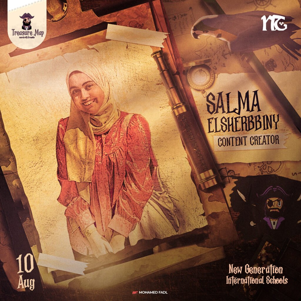
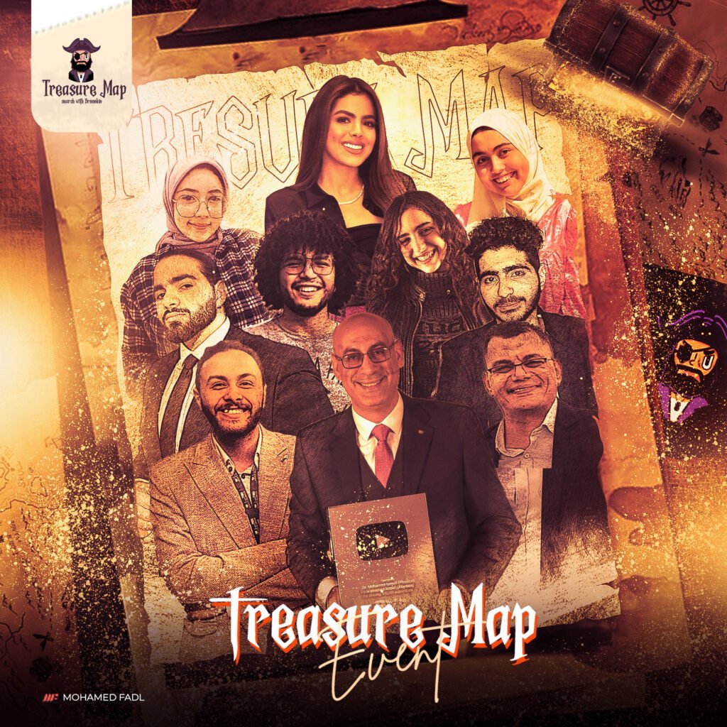
TECHNO MAP IS A SOCIAL STUDENT ACTIVITY THAT EMPOWERS STUDENTS IN TECHNOLOGY FIELDS THROUGH A VARIETY OF EDUCATIONAL POSTS, VIDEOS, AND LIVE BROADCASTS ABOUT ALL TECHNOLOGY. IT AIMS TO INCREASE THE AWARENESS CONCERNING MAJORS WHICH WILL OCCUPY MOST CAREER FIELDS IN UPCOMING FUTURE. THESE ARE LIKE PROGRAMMING, ARTIFICIAL INTELLIGENCE, AND MECHATRONICS. IT ALSO FOCUSES ON MEDICAL FIELDS LIKE BIOTECHNOLOGY.

The event is named “Treasure Map,” symbolizing the journey and exploration that participants will undergo throughout the campaign. Just like a treasure map leads to hidden riches, our campaign will guide participants through a series of events and activities that are fun, engaging, and aligned with our theme.
Each design in the campaign will be carefully crafted, ensuring that all visuals, colors, and elements are tied to the pirate adventure theme. Whether it’s through treasure chests, pirate ships, or mysterious islands, the audience will feel like they are part of a grand quest.
Before diving into the campaign, we went through a crucial brainstorming and sketching phase. This phase was all about exploring ideas, experimenting with different concepts, and refining our vision. It was during this creative process that the pirate theme for the campaign began to take shape.
Before diving into the campaign, we went through a crucial brainstorming and sketching phase. This phase was all about exploring ideas, experimenting with different concepts, and refining our vision. It was during this creative process that the pirate theme for the campaign began to take shape.

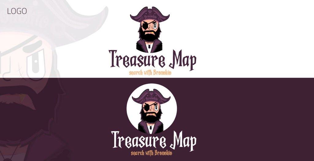
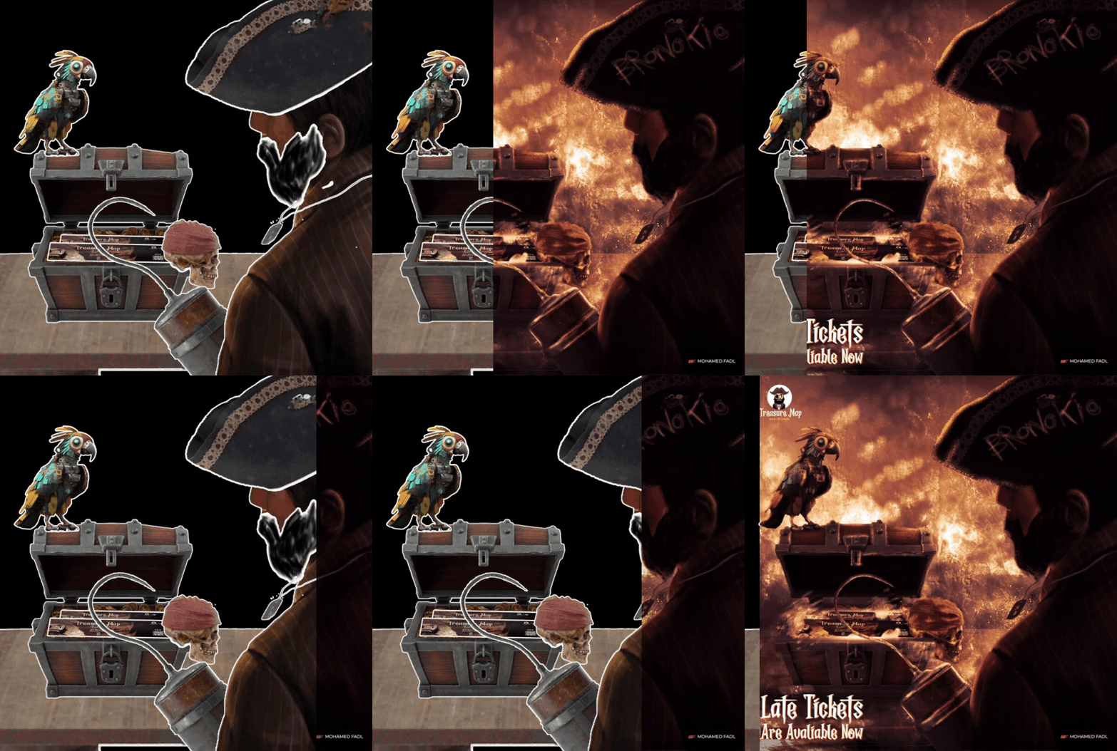
This transformation led to the creation of “Bronokio”, a name that cleverly blends Bruno’s original identity with his new pirate persona, representing his journey and the story we aim to tell. The new logo and character design reflect both the evolution of the event and the creativity of the team during this phase, helping to set the tone for the entire campaign.
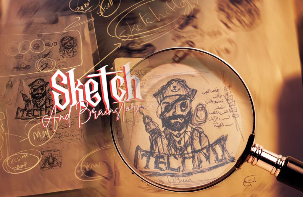
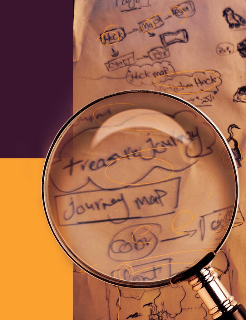
This period of brainstorming and sketching was essential, as it allowed us to refine our ideas and ensure that every detail, from the theme to the logo, carried a cohesive story that would engage our audience throughout the campaign.

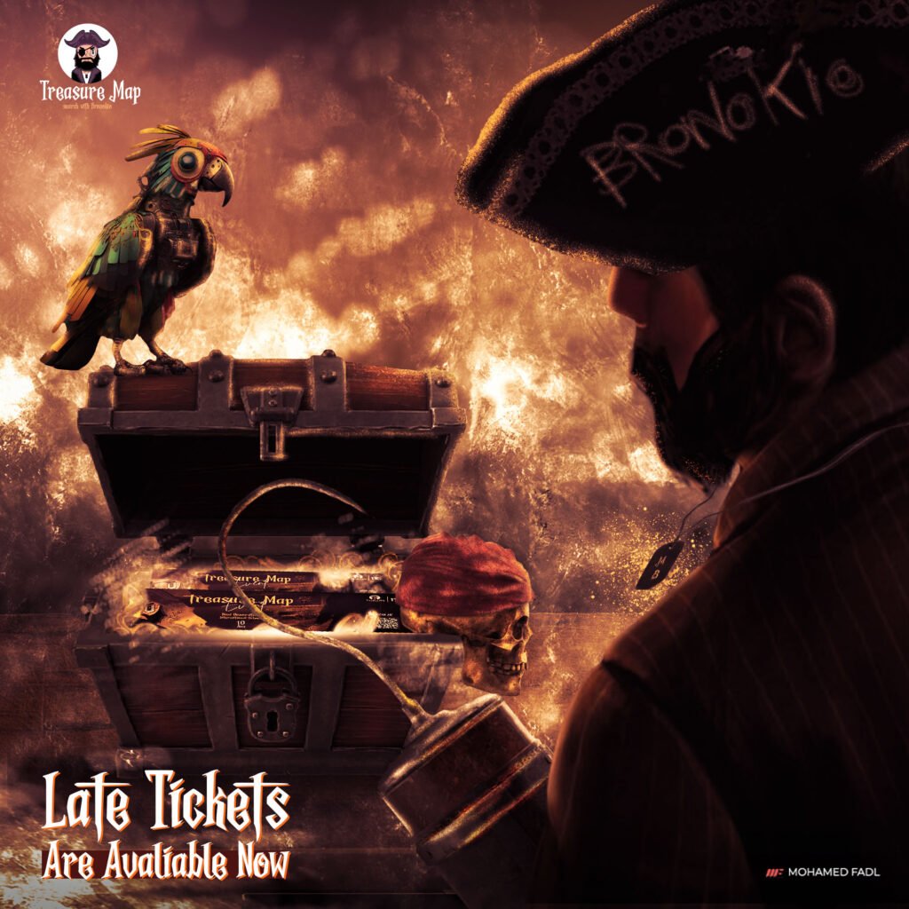
At this point, the idea truly comes to life with the first design of the event, which serves as the cornerstone for all upcoming designs. This initial design is more than just a visual introduction—it is carefully crafted to tie together every element of the campaign that follows.


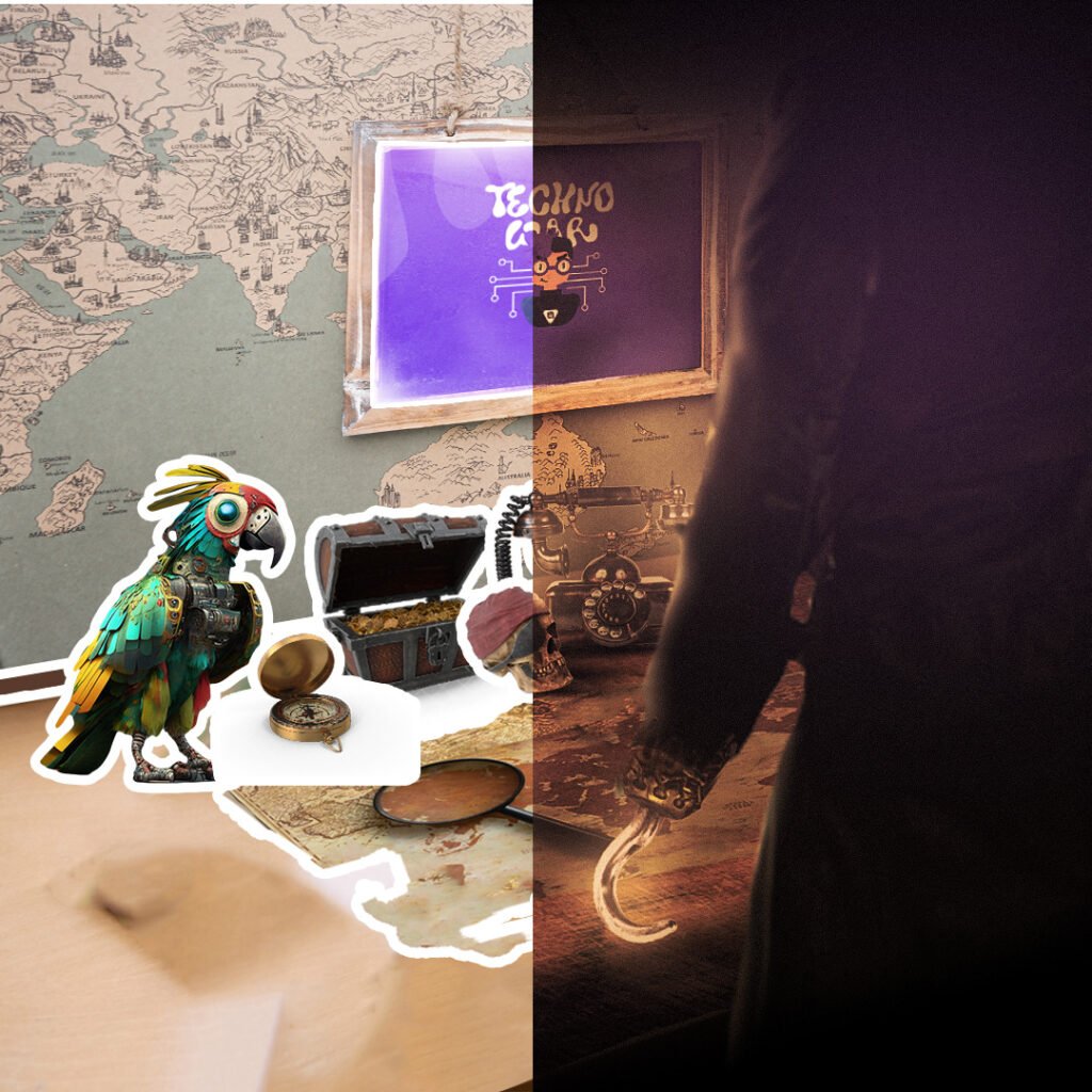
Among the designs we’ve developed, the social media visuals play a vital role in keeping the audience engaged and interactive throughout the campaign. These designs are not just promotional materials, but key elements in maintaining a consistent connection with our community.

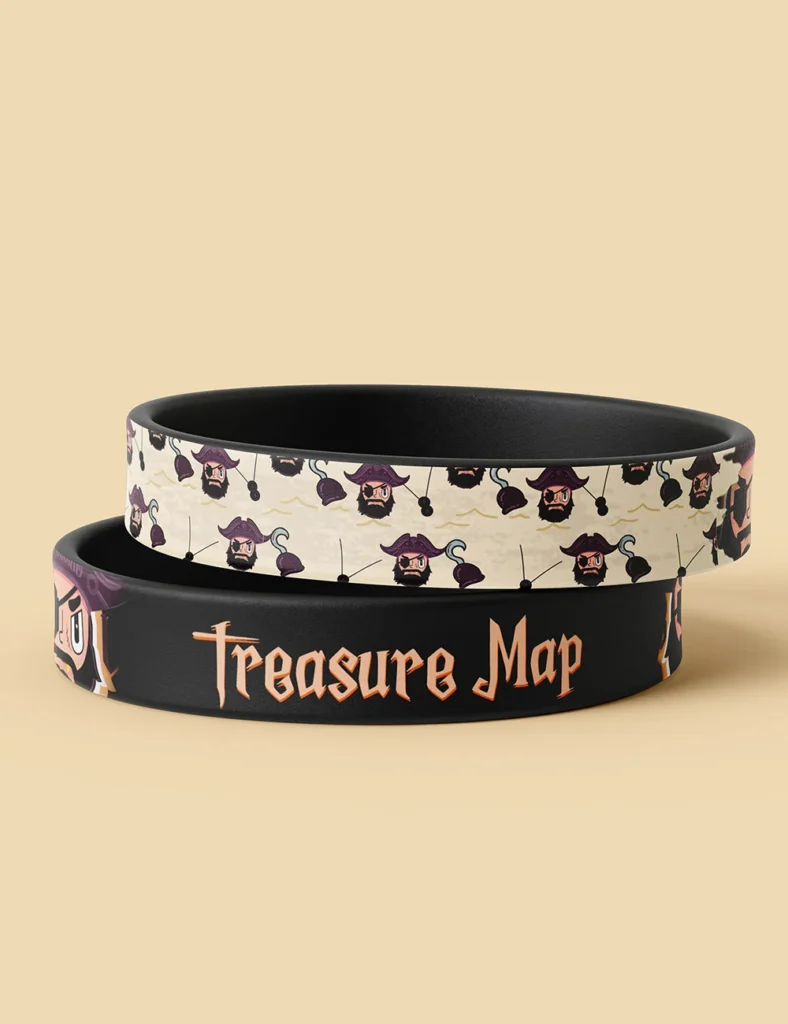
The souvenirs were a key element of the campaign, and the design played a critical role in ensuring they left a lasting impression. We wanted the souvenirs to not only be visually appealing but also to serve as a meaningful reminder of the event.
To fully immerse participants in the Treasure Map theme, we designed the event decorations with great attention to detail. Everything from the stage banners to the roll-up displays was crafted to enhance the pirate atmosphere and visually tie the event together.
We ensured that every aspect of the decoration aligned with the campaign’s identity, providing a seamless and cohesive environment for attendees. The stage banner prominently featured our pirate theme and the event’s logo, while the roll-up banners highlighted key information in a way that was both visually striking and easy to understand.
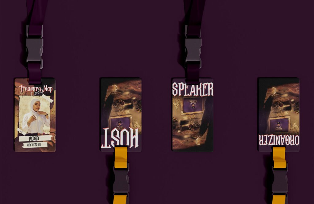
In addition to the décor, we wanted to ensure that our team of organizers was easily recognizable. To achieve this, all of the organizers wore uniform T-shirts that reflected the event’s identity. These T-shirts made it simple for attendees to identify the team, ensuring smooth communication and easy access to assistance throughout the event.

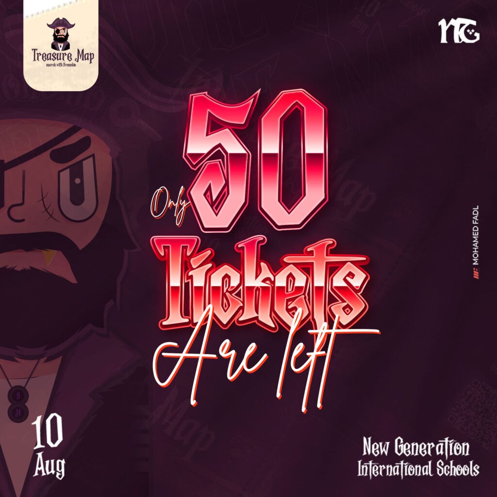
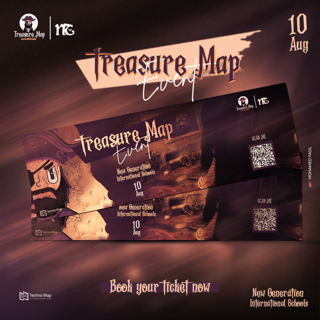
The ticket designs were one of the most important aspects of the event. We wanted the tickets to reflect the Treasure Map theme, turning them into more than just an entry pass but a memorable part of the overall experience.
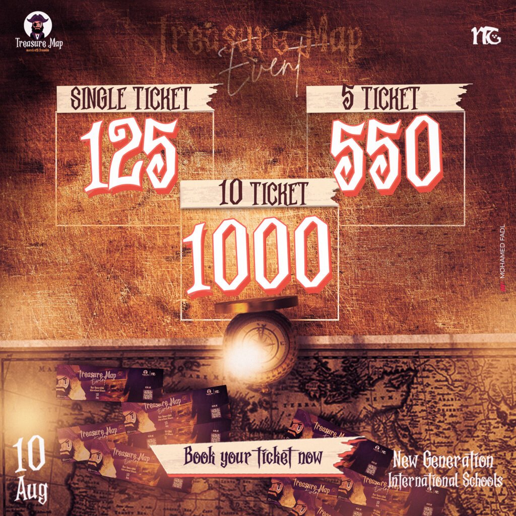
In addition to the tickets themselves, we also developed reminder designs to help attendees keep track of the number of tickets they had purchased or reserved. These reminders were sent out digitally and designed to align with the campaign’s identity, making them not only functional but also visually engaging.


As previously mentioned, the decorations were a crucial part of creating the immersive pirate atmosphere for the Treasure Map event. The following images showcase how the event space was transformed to reflect the campaign’s identity.

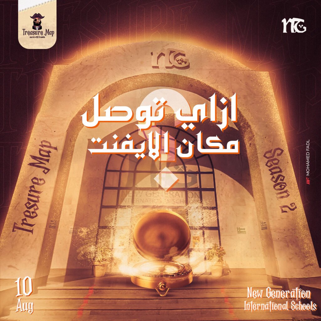
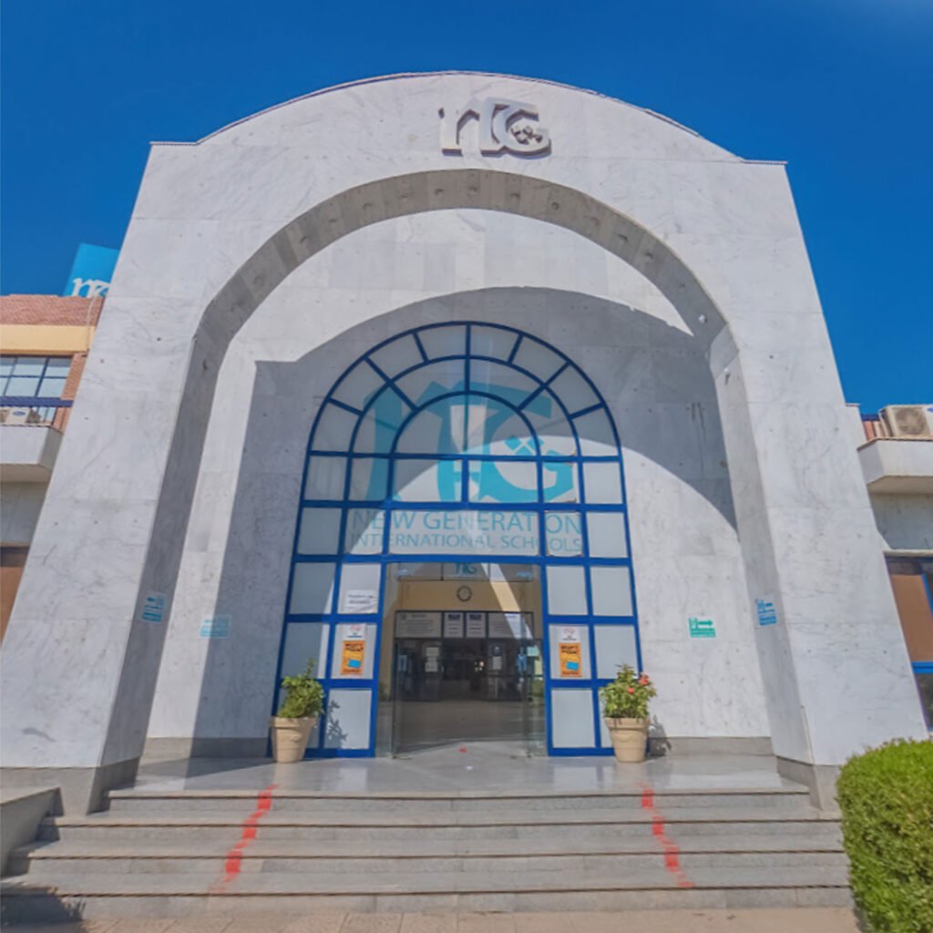
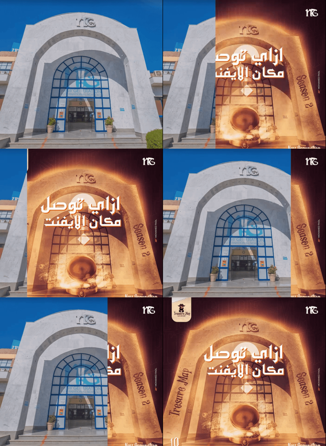
In organizing an event, one of the most crucial aspects is ensuring that attendees can easily find their way to the venue. Our approach involved a thoughtful design that incorporates a dedicated gateway for the event space, which serves as a clear point of entry.
To convey this idea effectively, we developed a simple visual design that encapsulates the essence of navigation. A key element of our design was the inclusion of a compass, a symbol of direction and guidance. This compass ties back to our initial design concept, emphasizing the importance of orientation in a bustling event setting.
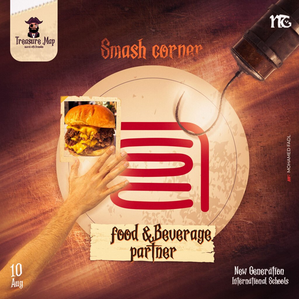
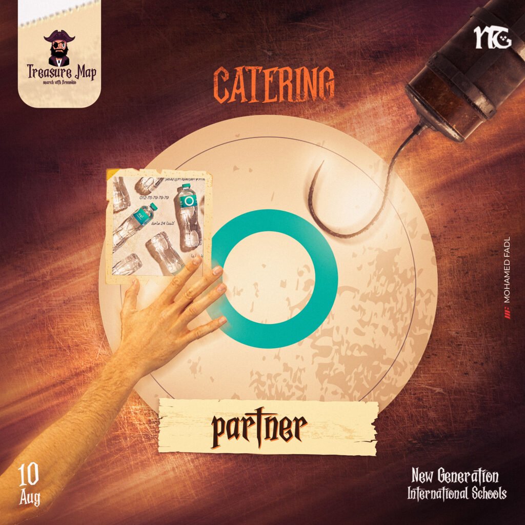
In every event, partners play a vital role in enhancing the overall experience. Our design not only focuses on guiding attendees but also highlights the importance of these partnerships.


Our design features dedicated spaces to prominently display sponsor logos and branding, ensuring they are easily recognizable to attendees. This visibility not only acknowledges their contributions but also reinforces the partnership between the event and its sponsors.


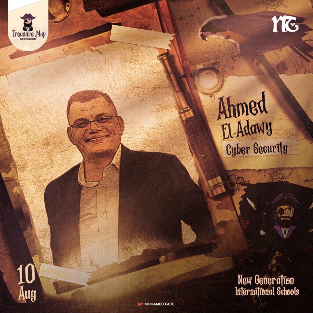
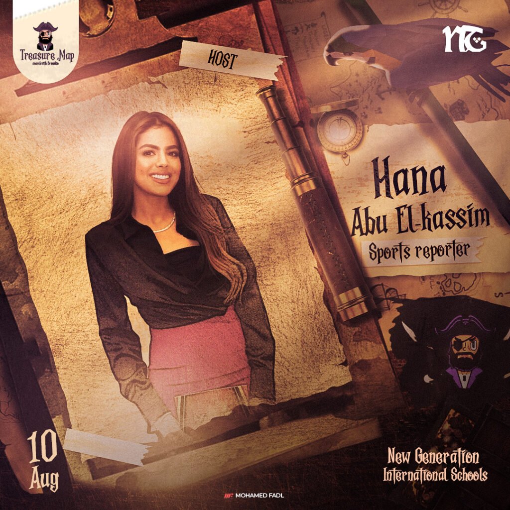
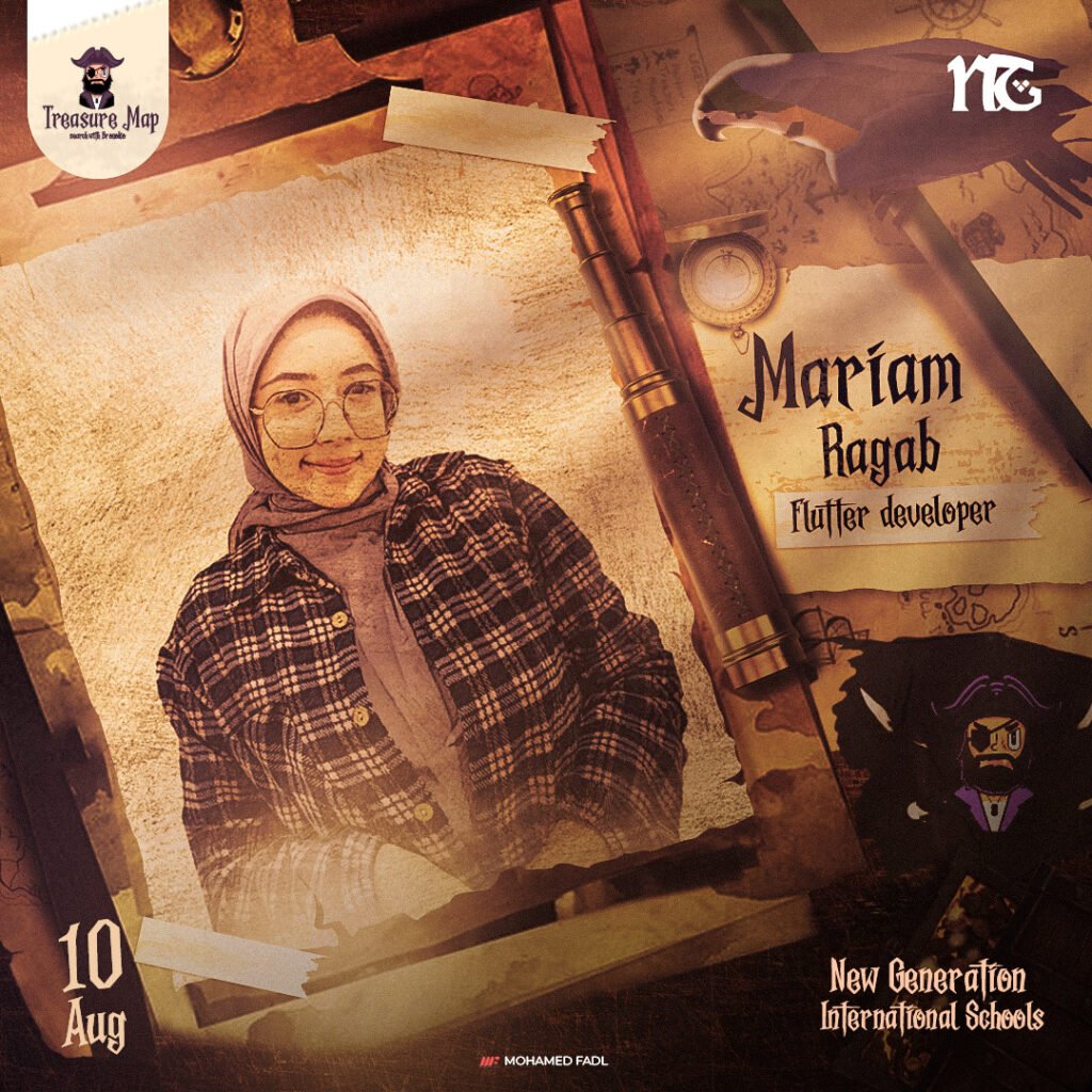
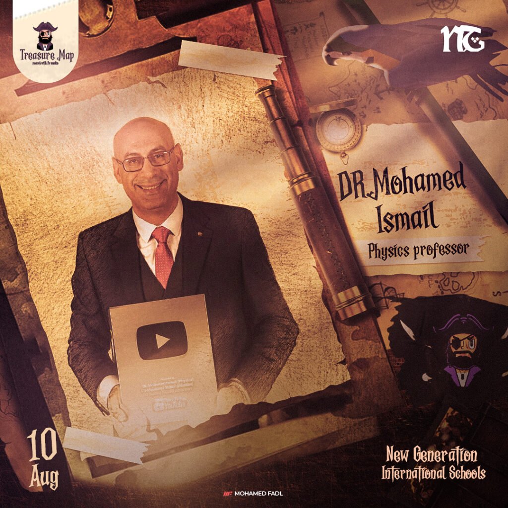
One of the most critical aspects of our event design is the visual representation of the speakers. We understand that the speakers are central to the event’s success, and their presentations must resonate with the audience.
